Controls - How to workaround the bug when setting Radio Button fill color dynamically
An interesting behaviour that's been reported is a bug when dynamically setting the fill colour of a radio button.
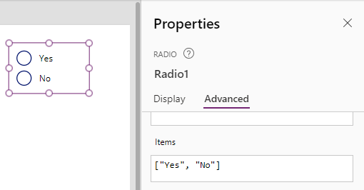
To illustrate, let's take a radio control that contains yes and no values. We set the control's Items property as follows.
To illustrate, let's take a radio control that contains yes and no values. We set the control's Items property as follows.
["Yes", "No"]

The requirement is to set the fill colour to red when the user selects "No" and to set it to green when the user selects "Yes".
To implement this, we set the Fill property of the radio control to the following formula.
Switch(Self.Selected.Value,
       "Yes", Color.Green,
       "No", Color.Red,
       Color.White
)
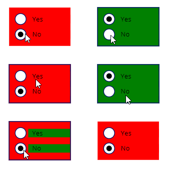
In theory, this should work however, when the user selects "Yes", the control renders like so. Notice how the labels on the control show the previous colour and only resets when the user hovers the mouse over the control.
Note that the HoverFill property is set to "Self.Fill" by default, and editing the other display-related properties on the control make no difference.

This appears to be bug so until Microsoft resolves this, a workaround is to add a separate label control behind the radio control. We clear the Text property of the label and set the Fill property of the label like so:
Switch(Radio1.Selected.Value,
       "Yes", Color.Green,
       "No", Color.Red,
       Color.White
)
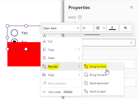
We place the radio control in front of the label using the 'Reorder > Bring to front' menu item.

Finally, we set the Fill colour of the Radio control to transparent like so:
RGBA(0,0,0,0)
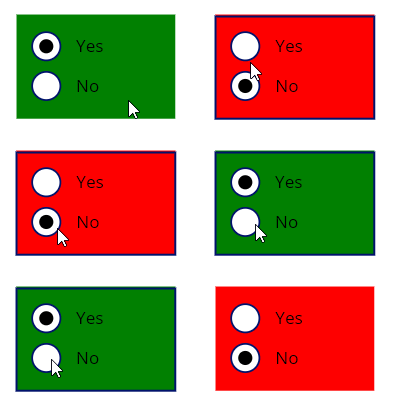
At run time, this now works as expected. When the user selects "No", the entire section appears red. When the user selects "Yes", the entire section appears green.

Hopefully, Microsoft will fix this Radio Fill colour bug in a future release of Power Apps.
