Controls - How to create rounded labels - workaround
A question that arises occasionally from app builders is - how do we round the corners of labels?
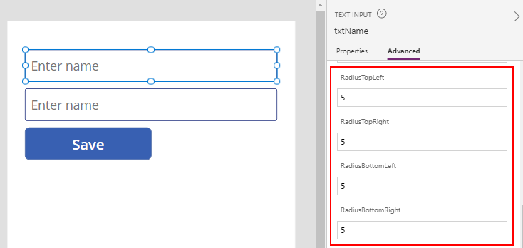
By default, text input controls and buttons are rounded. The setting that controls this are the four radius settings - RadiusTopLeft, RadiusTopRight, RadiusBottomLeft, RadiusBottomRight. These settings control the level of rounding on the four corners of a control.
By default, text input controls and buttons are rounded. The setting that controls this are the four radius settings - RadiusTopLeft, RadiusTopRight, RadiusBottomLeft, RadiusBottomRight. These settings control the level of rounding on the four corners of a control.
Unfortunately, most other controls do not include these radius settings - including shapes, icons, combo boxes, date pickers, and labels.
Where there's a requirement to round the border of labels (for
presentational reasons, or to match the rounding of other text input or
button controls on a screen), we can work around this limitation by using a text input control instead.
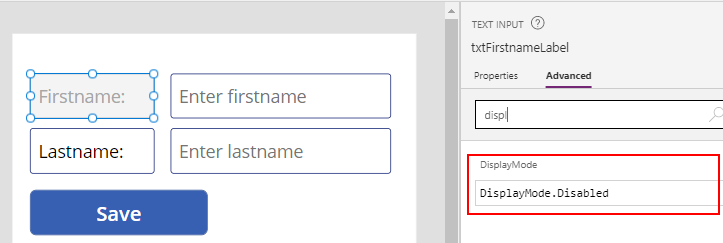
We add a text input control and set the DisplayMode property to Disabled. When a text input control is disabled, a user cannot interact with the control and it effectively behaves like a label.
To modify the appearance of the control and border, we set the disabled properties of the control. A key setting to modify is the DisabledFill property of the control, which defaults to gray.
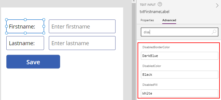
Here's a summary of the property values that we've modified for this example.
DisplayMode = DisplayMode.Disabled
DisabledFill = White
DisabledColor = Black
DisabledBorderColor = DarkBlue
At runtime, the text input control will behave like a label, and the corners will be rounded.
Conclusion
There's no built in way to round the corners of a label, but we can workaround this limitation by using a disabled text input control instead, and configuring the disabled color and fill properties.