Controls - How to build a component for users to enter numbers with a set of connected slider and text input controls
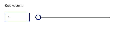
To make it easier for users, some app builders want to provide the ability to enter numbers using a set of connected text input and slider controls.
With this design, the user can use a slider control to select the value. In this case, the text input control will be updated to show the selected number. If the user were to enter a number into the text input control instead, the slider control would update itself to show the selected number.
We can implement this design with the help of a variable, and the underlying technique is highlighted in the forum post beneath.
Today, the best practice way of building this type of feature is to encapsulate the functionality within a component. This makes it possible to reuse the feature in multiple applications.
Therefore, this post walks through how to build a component that carries out this task and demonstrates how to add the component to a form.
Building the "connected slider-text input control" component
Here are the steps to build the component. To begin, we add a new component and insert two controls - a text input control and a slider control. The best practice for greater reusability is to add the new component to a component library.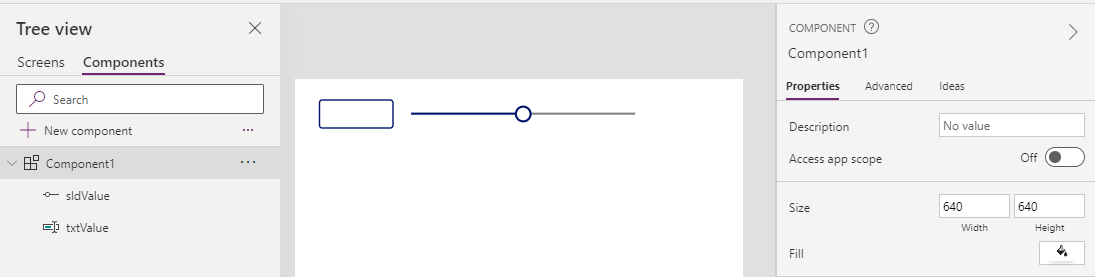
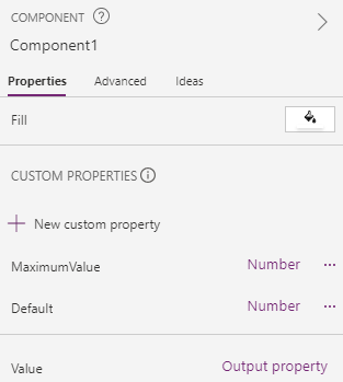
Next, we add the following 3 custom properties:
- MaximumValue - this defines the maximum value that the user can select using the slider control.
- Default - this is an input property that specifies the default value of the component.
- Value - this is an output property that returns the numeric value that the user enters through the component.
For the MaximumValue and Default properties, we should enable the 'Raise OnReset when value changes' checkbox.
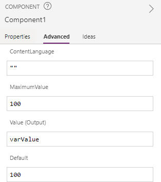
How to configure the Slider control
To initialise the component, we need to assign the Default property to a variable. We accomplish this by adding the following formula of the OnReset property of the component.
Set(varValue, Self.Default)
When the user updates the value with the slider control, we need to update the variable value. We do this by setting the OnChange property of the slider control like so:
Set(varValue, Self.Value)
Whilst we're editing the slider control, we also need to define the maximum permissible value of the slider by setting the Max property like so:
Parent.MaximumValue
To set the default value of the slider control, we set the Default property like so:
varValue
How to configure the Text input control
When the user updates the value with the text input control, we need to
update the variable value. We do this by setting the OnChange property
of the text input control like so:
To set the default value of the text input control, we set the Default property like so:
Finally, we set the Format property to 'Number' to ensure that users can only enter numbers.
Set(varValue, Value(Self.Text))
To set the default value of the text input control, we set the Default property like so:
Text(varValue)
How to configure the Output property
Finally, we need to configure the component to return the selected value. We apply this setting through the properties of the component. We set the "Value (Output)" property like so:
varValue
At this point, our component is complete and we can add it to a screen.
Example - How to incorporate the component into an existing 'edit' screen
To demonstrate, we can now add the component to an app and configure it to save a value to a datasource.
Example - How to incorporate the component into an existing 'edit' screen
To demonstrate, we can now add the component to an app and configure it to save a value to a datasource. For this example, we'll take an app that's created with the 'start with data' feature. This app is based on a table of property records, and we'll adapt the app to save the 'bedroom' field to the table.
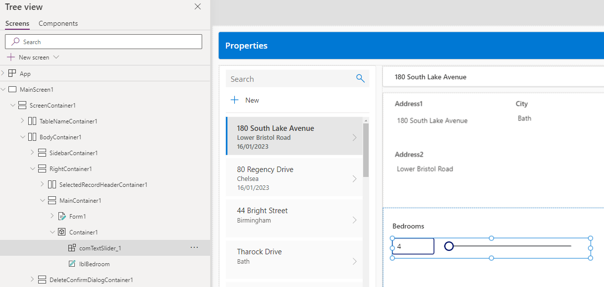
Assuming that we created the component inside a component library, we can use the insert menu item to add the component and insert it onto the screen. Since a limitation of components is that they can't be added inside a
form control, we add the control outside of the auto-generated EditForm.The name of the added component in this example comTextSlider_1.
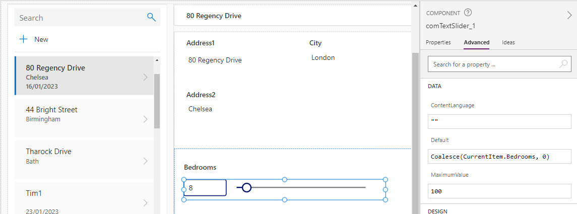
We can now set the Default property of the component to load the existing value. With the built-in template, the CurrentItem variable returns the selected value in the gallery. Therefore we can set the default property of the component as shown below. This formula coalesces the existing 'Bedroom' value to 0 (to handle records with a blank value).
Coalesce(CurrentItem.Bedrooms, 0)
To save the selected value, we add the bedroom field to the existing form using the Fields section of the form editor.
We set the Update property of the 'bedroom' card to the following formula:
comTextSlider_1.Value
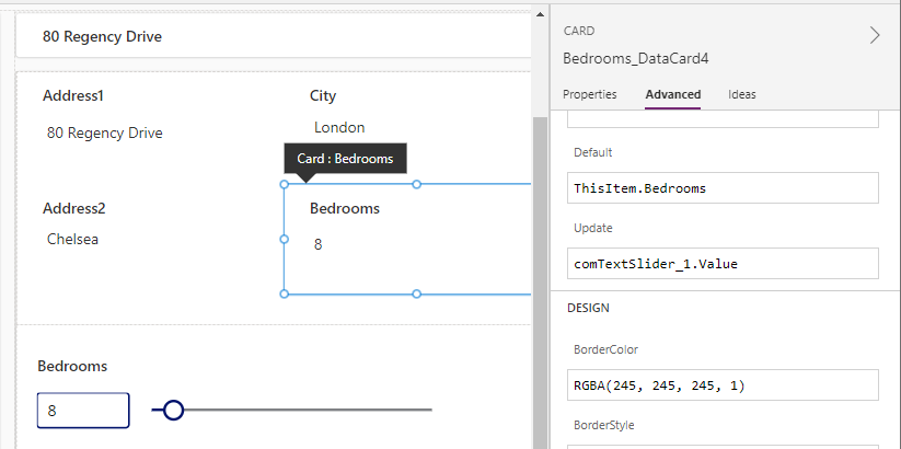
Finally, we can then hide the card to make it invisible. This process of using a hidden card provides a workaround for the lack of support for adding components to forms.
This now completes the changes and we can now run our app. The user will now be able to update the value using either the slider or the text input controls.
Conclusion
This post walked through how to build a component that enables users
to enter numeric values using a connected text input and slider control. It then described briefly how to add the control to an auto-generated app.