Model Driven App - How to apply an input mask to a text input field
With model driven apps, we can apply an input mask to single line text input fields. The process is slightly complex because can only use the classic designer to carry out this task. In this post, we'll walk through this process.Example requirment
To demonstrate, let's take an employee table that stores employee details, including national insurance numbers. A UK national insurance number consists of 2 letters, 6 numbers and a final letter. Here's an example of how such a number looks:
Applying an input mask to a form field
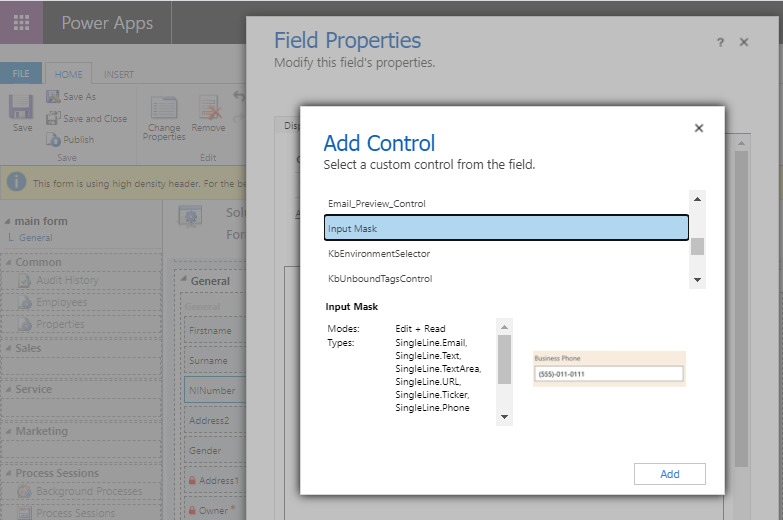
From the classic designer, we select our 'national insurance' field and click the 'Change properties' button from the ribbon bar. This opens the 'Field properties' dialog. From here, we select the controls tab, click the 'Add control' link, and select 'Input Mask'.
Specifying the input mask
For this example, we apply the following mask.
How the input mask looks at runtime
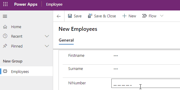
At this stage, we can save and publish our form, and run our app. As this screenshot beneath shows, the control applies an input mask and ensures that users enter the NI number in the correct format.
Example requirment
To demonstrate, let's take an employee table that stores employee details, including national insurance numbers. A UK national insurance number consists of 2 letters, 6 numbers and a final letter. Here's an example of how such a number looks:QQ 12 34 56 A
In this post, we'll build a form with a masked input control for this field.
Applying an input mask to a form field
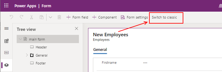
The first step is to build a form. The form designer in Power Apps does not support the input mask control. Therefore, we click the 'switch to classic 'button to open the classic designer.
From the classic designer, we select our 'national insurance' field and click the 'Change properties' button from the ribbon bar. This opens the 'Field properties' dialog. From here, we select the controls tab, click the 'Add control' link, and select 'Input Mask'.
Specifying the input mask
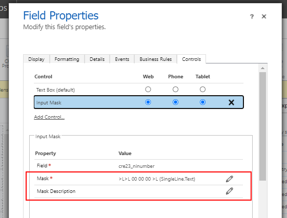
Once we add the input mask control, we can specify the mask. Here are the acceptable mask characters that we can use.
0 – Digit
9 – Digit or space
# – Digit, sign, or space
L – Letter
I – Letter or space
A – Alphanumeric
A – Alphanumeric or space
< – Converts characters that follow to lower case
> – Converts characters that follow to upper case
| – Disables case conversion
\ – Escapes any character, turning it into a literal
>L>L 00 00 00 >L
We apply this as a static mask. An additional feature is that we could specify a mask from data instead. Notice with this example, how we specify the greater than symbol to automatically convert any character that the user enters into upper case.
An important step is to check the 'web' radio button against the 'input mask' control..
How the input mask looks at runtime
At this stage, we can save and publish our form, and run our app. As this screenshot beneath shows, the control applies an input mask and ensures that users enter the NI number in the correct format.Conclusion
With model driven apps, we can apply an input mask against single line text fields. In this post, we walked through how to apply this feature with the classic designer. For further reading, we can refer to the online documentation here.