Charts - A simple way to create better graphs and charts
If you're looking for a simple way to create more powerful charts in Power Apps, here's a tip that I recently saw from Superuser Daniel Bocklandt.
The basic capabilities of the built-in charts in Power Apps can often make it difficult to build and configure the charts we want. For instance, hiding the plot line on a 0 value in a line graph (instead of plotting a 0 value) isn't possible.
How Quickchart.io works
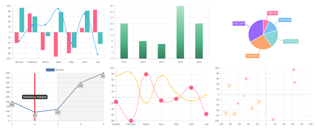
QuickChart is an online charting service. It offers a much wider range of chart types compared to the Power Apps chart control, including bar, line, radar, pie, doughnut, polar area, scatter plot,
bubble, area, gauge, box plot, violin plot, and word cloud charts.
With QuickChart, we define a chart in JSON format like so.
{
  type: 'bar',                                // Show a bar chart
  data: {
    labels: [2012, 2013, 2014, 2015, 2016],   // Set X-axis labels
    datasets: [{
      label: 'Users',                         // Create the 'Users' dataset
      data: [120, 60, 50, 180, 120]           // Add data to the chart
    }]
  }
}
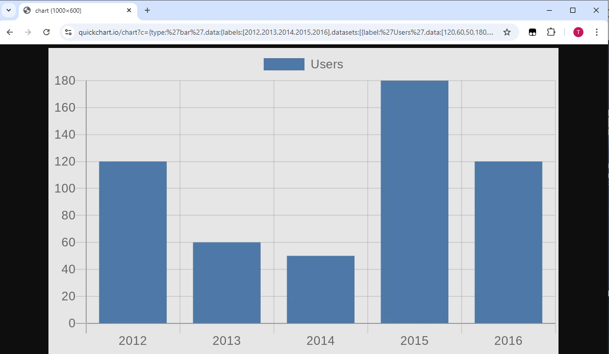
We can then display the chart in a browser by passing the JSON as a URL argument like so:
https://quickchart.io/chart?c={type:'bar',data:{labels:[2012,2013,2014,2015,
 2016],datasets:[{label:'Users',data:[120,60,50,180,120]}]}}
Here's how this chart appears in a browser.
By using this technique, we can use the QuickChart.io service to display charts in Power Apps through with an image control.
Demonstration of how to display a chart in Power Apps
To demonstrate how to display a chart in Power Apps, let's take the following collection of data.
ClearCollect(
    colGraphData,
    {Year: 2012, Value: 120},
    {Year: 2013, Value: 60},
    {Year: 2014, Value: 50},
    {Year: 2015, Value: 180},
    {Year: 2016, Value: 120}
)
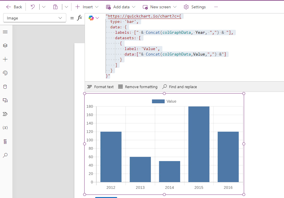
To display a bar chart, we add an image control to our app and set the Image property to the following formula:
The screenshot below shows how this looks."https://quickchart.io/chart?c={ type: 'bar', data: { labels: ["& Concat(colGraph,Year,",") &"], datasets: [ { label: 'Value', data:["&Concat(colGraph,Value,",") &"] } ] }
}"
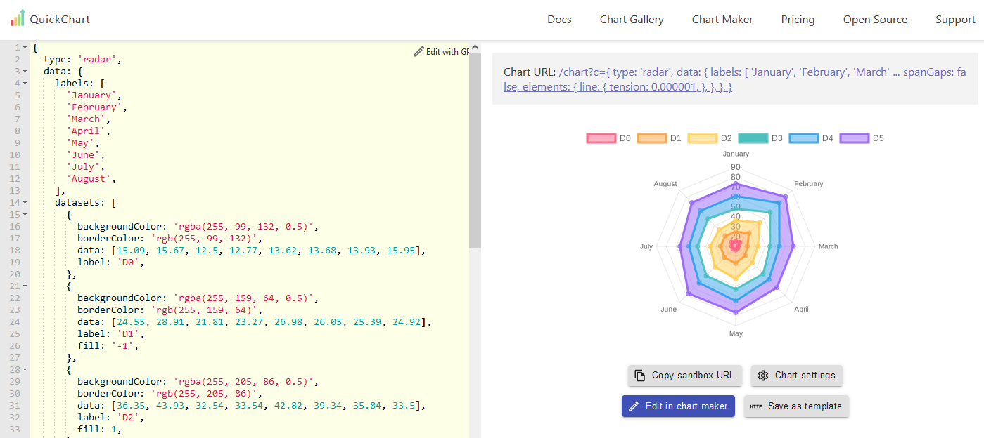
The QuickChart.io website contains JSON examples for all chart types, including JSON settings to customise colour and other attributes of the chart (illustrated below). This 'playground' provides a simple way to build and debug the appearance of apps outside of the Power Apps designer.
In terms of licensing, there is a free community edition that's available for non-commercial use. The commercial use licenses start at around $35.
For more details, the link to the QuickChart.io site is here.
Conclusion
If you're looking to use charts to visualise data in Power Apps, using QuickChart.io and an image control is another technique to add to your toolkit. Compared to using chart components or PowerBI, this provides a relatively simple way to create richer charts.