Settings - Old Layout vs New Layout (2021)
The latest update to Power Apps introduces a new format to the settings area. This post compares the old layout to the new layout, and summarises the settings that exist in each area.
The Old Layout
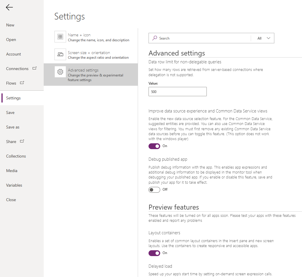
This is the old layout that many of us are familiar with. Effectively,
all the interesting settings were lumped into the ‘advanced settings’ area.
The area was further grouped by "preview
features", "experimental features", and "deprecated features" headings.

Introducing the New Layout (2021)
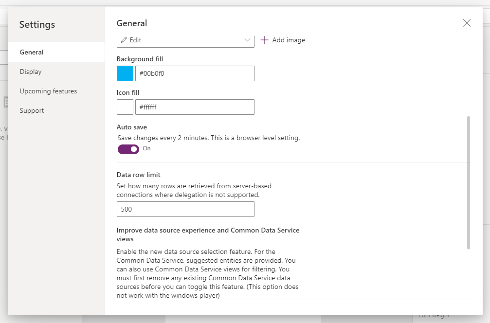
As the screenshot beneath shows, the new layout looks much tidier and more organised. It groups the settings into a series of vertical tabs – General, Display, Upcoming features, and Support.
We
can reach this area through the File > Settings and File > Account
menu items. Previously, these menu items linked to two separate pages. The information that used to appear in the File > Settings menu
item, now appears inside the Support tab.

Here's what we'll find inside the ogher tabs:
- General - this tab contains settings that control the name, icon, and other general settings. The most notable setting we find here is the ‘data row limit’ setting.
- Display - this tab contains the settings for app orientation, scale to fit, and lock aspect ratio options.
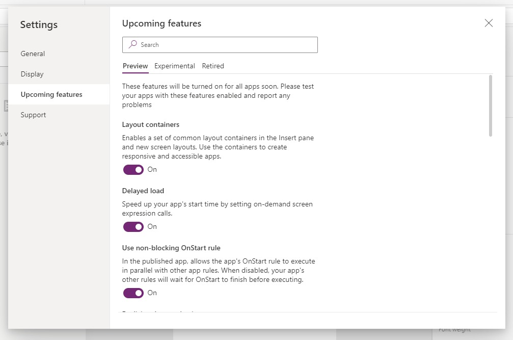
- Upcoming features - this tab shows the remaining settings, which typically relate to upcomming performance options. It arranges these settings by a horizontal tab that includes the headings Preview, Experimental, and Retired. There is also a search box to make it easier to find a setting.

For Nostalgia - the 2017 Layout
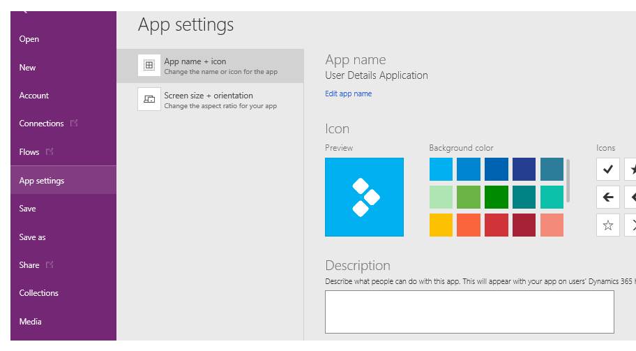
Finally for nostalgic purposes, here’s a screenshot that I made of the settings area in 2017. The illustration highlights how far Power Apps has advanced.
None of the advanced settings that we enjoy today were available. It’s quite hard to believe but at that time, there wasn’t the option to increase the data row limit to 2,000 - a setting that many of us rely on today! At that time, we were strictly limited to 500 rows.
Conclusion
The new format of the settings area is a big improvement. Compared to the old layout, the new groupings and headings make it easier to find settings.

