Charts - How to create donut charts
A relatively simple and common way to display donut charts in Power Apps is to build an SVG (scalable vector graphic) image. The SVG format is XML-based, and the big benefit of this is that we can manipulate the content through formula. This is the area where most questions arise, so this post provides an introduction to how to build a simple donut chart and how to set the value.
How to create a simple donut chart
The formula beneath shows the basic SVG markup that builds a donut chart. This syntax is frequently posted on the web and in forums, and we often see questions from app builders that reference this code."data:image/svg+xml," &To display this chart, we set the image property of an image control to the code above.
EncodeUrl(
"<svg width='100%' height='100%' viewBox='0 0 42 42'
class='donut' xmlns='http://www.w3.org/2000/svg'>
<circle class='donut-hole' cx='21' cy='21'
r='15.91549430918954' fill='#fff'></circle>
<circle class='donut-ring' cx='21' cy='21'
r='15.91549430918954' fill='transparent'
stroke='#ce4b99' stroke-width='3'></circle>
<circle class='donut-segment' cx='21' cy='21'
r='15.91549430918954' fill='transparent'
stroke='#d2d3d4' stroke-width='3'
stroke-dasharray='70 30' stroke-dashoffset='25'></circle>
</svg>"
)
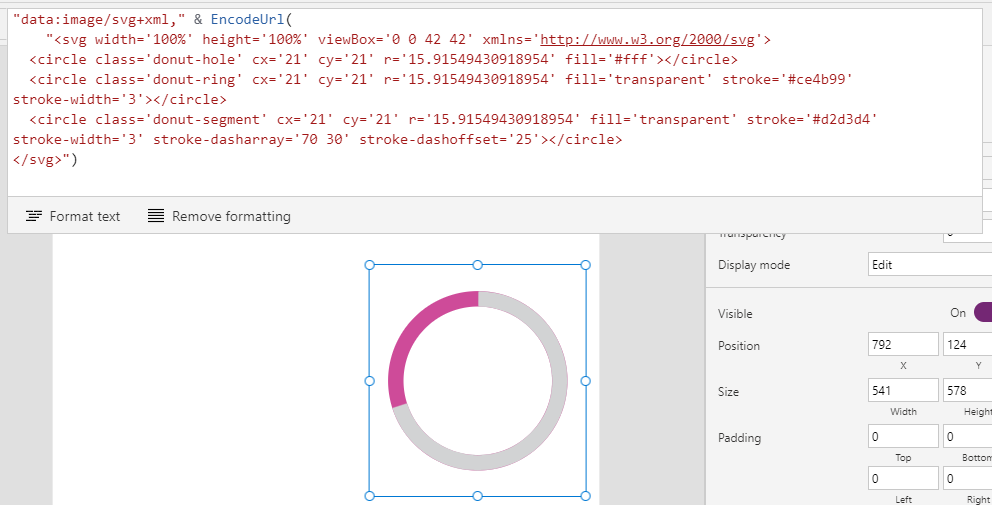
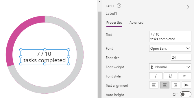
The typical way to complete the chart is to superimpose a label over the image control, as shown below. This label could show numeric values or a description.
How does the SVG markup work?
The SVG markup contains three main circles - 'donut hole', 'donut ring', and 'donut segment'.- 'donut hole' is the circle that makes the middle of the donut white
- 'donut ring' defines the outer circle
- 'donut segment' defines the chart segment, and this is the node that we modify to set the value
'donut segment' shows the value of the donut segment. This includes a 'stroke-dasharray' attribute which contains two numbers - each number here must add up to 100 (eg 100%). If
the values don't add up to 100, additional blocks will appear in the
segment node.
Let's suppose we want to configure the segment to show 70%, as in the example above (eg, 7/10 tasks completed). We would accomplish this by setting the 'stroke-dasharray' attribute as follows:
stroke-dasharray='70 30'
With all the circle objects, the fill and stroke attributes define the colour.
The 'r' value defines the radius of the circle. You might be curious as to why this is set to 15.9154.... The reason is because the chart is based on a circle circumference of 100. 15.9154 is the radius that we derive through the mathematical formula c=2πr (circumference = 2 * pie * radius).
For a complete explanation of the logic behind the SVG for the donut chart, Mark Caron has an excellent post here:
How to dynamically set the value of a donut chart
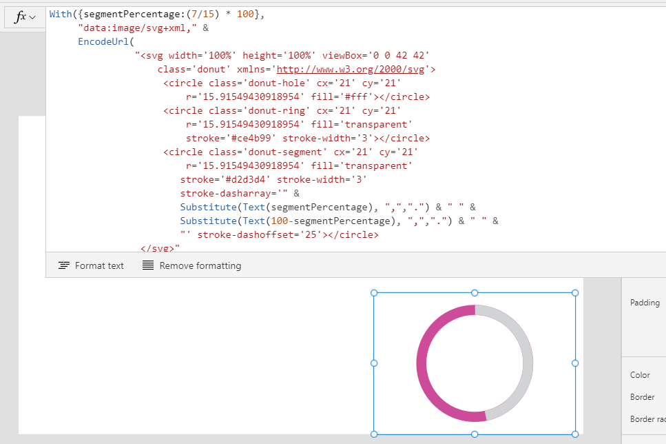
Based on the details above, here's the formula to set the segment value of a donut chart.
With({segmentPercentage:(7/15) * 100},
     "data:image/svg+xml," &
     EncodeUrl(
               "<svg width='100%' height='100%' viewBox='0 0 42 42'
                   class='donut' xmlns='http://www.w3.org/2000/svg'>
                    <circle class='donut-hole' cx='21' cy='21'
                        r='15.91549430918954' fill='#fff'></circle>
                    <circle class='donut-ring' cx='21' cy='21'
                        r='15.91549430918954' fill='transparent'
                        stroke='#ce4b99' stroke-width='3'></circle>
                    <circle class='donut-segment' cx='21' cy='21'
                        r='15.91549430918954' fill='transparent'
                       stroke='#d2d3d4' stroke-width='3'
                       stroke-dasharray='" &
                       Substitute(Text(segmentPercentage), ",",".") & " " &
                       Substitute(Text(100-segmentPercentage), ",",".") & " " &
                       "' stroke-dashoffset='25'></circle>
                </svg>"
      )
)
We replace the segmentPercentage value with our target values. The above example hardcodes the value 7/15 to represent 7 out of a possible 15. In practice, we would replace these hardcoded values with variables, or with 'ThisItem.Fieldname' references if we were hosting the chart on a form or gallery.
The
formula above also substitutes commas with full stop characters. This addresses a very important issue for non-English users.
For users who use languages where the comma represents the decimal point separator symbol (eg Spanish, French, German), introducing fractional numbers into an SVG image that contains commas will corrupt the image. The post beneath
highlights this specific issue.
https://powerusers.microsoft.com/t5/Building-Power-Apps/Power-Apps-code-does-not-work-in-languages-other-than-English/m-p/1235063
Finally, the screenshot beneath shows how this formula appears at runtime.
Conclusion
An effective way to build donut charts is to create an SVG image that represents the chart. This post described the formula to apply this technique, including how to set the donut chart segment value with formula.