Blog
Charts - How to extend canvas apps with additional chart types
March 13. 2021
The built-in chart types for canvas apps are limited to bar, line, and
pie charts. A great way to extend the range of available chart types to
use Todd Baginski's Canviz Power Apps Chart Components.
This is an open source component that we can download from the following site:
https://github.com/OGcanviz/ChartComponents
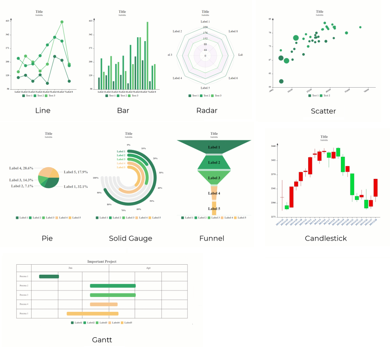
It offers a range of nine chart types, which include solid gauge, funnel, line, bar, pie,radar, scatter,
candle stick, and gantt chart types. The following screenshot (taken from the website) illustrates these chart types.
How to display a chart that uses one of these enhanced types
The quick start guide here provides a full description of how to use these controls.
https://ogcanviz.github.io/ChartComponents/#/
This is an open source component that we can download from the following site:
https://github.com/OGcanviz/ChartComponents
It offers a range of nine chart types, which include solid gauge, funnel, line, bar, pie,radar, scatter,
candle stick, and gantt chart types. The following screenshot (taken from the website) illustrates these chart types.
How to display a chart that uses one of these enhanced types
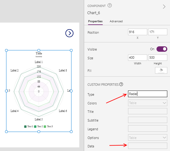
These charts are distributed as a canvas component from an msapp file. To use a custom chart type, we download and import the component into an app.
Next, we add the chart component to a screen, and set the 'chart type' and data properties to configure the chart.
https://ogcanviz.github.io/ChartComponents/#/
Conclusion
The "Canviz Power Apps Chart Component" offers a great way to extend the charting capabilities of canvas apps.
One caveat of using charts in canvas apps, is that data delegation limitations can make it difficult to accurately produce the source data for charts, particularly in cases where we want to sum or aggregate records by group.
In cases where we want to produce charts that are based on large datasets, Power BI may be a more suitable alternative.
- Categories:
- charts