Designer - 3 Features you may have missed in the screen designer
Microsoft make improvements to Power Apps all the time. It's hard not to miss the significant features that they add to the platform. However, when features are added to not so obvious places, such as behind right-click context menus and inside property panes, we sometimes only discover these features by accident. Here are three features that you may have missed.
This makes it quicker to access these settings, compared to the alternative of navigating away from the control in order to access the settings from the properties pane.

1. Right-click menu item to set fonts, colours, and styles
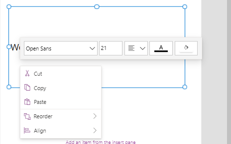
When we select controls such as labels and text input controls, the right-click menu item brings up a floating panel. We can use this to set the font, font size, background the foreground colours, and to apply the text justification setting.
This makes it quicker to access these settings, compared to the alternative of navigating away from the control in order to access the settings from the properties pane.

2. Right-click menu item to unlock cards
The right click menu item offers the option to unlock a card. This provides a quicker and more convenient way to carry out this task.
This is because the main unlock button appears at the very top of the properties pane, which makes it inconvenient to unlock cards, especially in cases when we're working with cards at the bottom of a form.
This is because the main unlock button appears at the very top of the properties pane, which makes it inconvenient to unlock cards, especially in cases when we're working with cards at the bottom of a form.

3. Radio control - aligning radio buttons horizontal and vertically
For a very long time, it wasn't possible to change the orientation of the radio items inside the radio control. The radio items would always display vertically, one on top of each other. This made difficult to build forms that maximised the available screen space.
It is now possible to change the layout to horizontal, which enables us to display radio items side-by-side.
It is now possible to change the layout to horizontal, which enables us to display radio items side-by-side.

