Portal - How to define section layouts with four, five, or six columns?
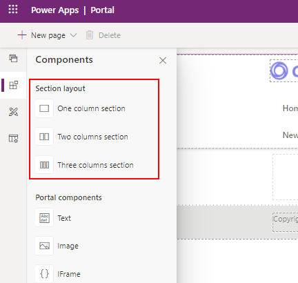
The page designer enables us to define section layouts that consist of one, two, or three columns. There may be a requirement to build a layout that consists of more than three equally spaced sections. In this post, we'll walk through one way to accomplish this.
Why is this a challenge?
By default, a portal uses the Bootstrap framework (v3.3.6). This enables us to build responsive pages by dividing a page into 12 sections.
It's easy to build a page with one, two, three, or six equally spaced columns. This is because we can wholly divide 12 by any of these numbers.
It's more difficult to build a page with five equally spaced columns because it's not possible to wholely divide 12 divided by 5. To solve this issue, we'll apply the CSS technique that the user Fizzix posted in this Stack Overflow post.
Defining a 4 column section
Before we look at the 5 column layout, let's start by looking at how to define a simpler four column section. We can accomplish this by specifying four sections with a width of 3.
If we add a 3 column section, we can open the code editor and modify the markup to include an additional column like so:
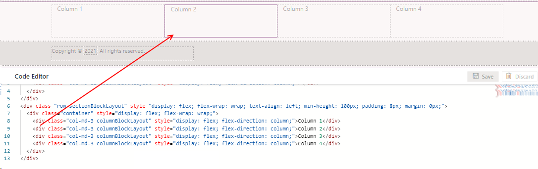
<div class="row sectionBlockLayout" >
  <div class="container" style="display: flex; flex-wrap: wrap;">
    <div class="col-md-3 columnBlockLayout" style="display: flex; flex-direction: column;">Column 1</div>
    <div class="col-md-3 columnBlockLayout" style="display: flex; flex-direction: column;">Column 2</div>
    <div class="col-md-3 columnBlockLayout" style="display: flex; flex-direction: column;">Column 3</div>
    <div class="col-md-3 columnBlockLayout" style="display: flex; flex-direction: column;">Column 4</div>
  </div>
</div>
As the screenshot beneath shows, this produces four equally spaced columns.
Defining a 6 column section
<div class="row sectionBlockLayout" >
  <div class="container" style="display: flex; flex-wrap: wrap;">
    <div class="col-md-2 columnBlockLayout" style="display: flex; flex-direction: column;">Column 1</div>
    <div class="col-md-2 columnBlockLayout" style="display: flex; flex-direction: column;">Column 2</div>
    <div class="col-md-2 columnBlockLayout" style="display: flex; flex-direction: column;">Column 3</div>
    <div class="col-md-2 columnBlockLayout" style="display: flex; flex-direction: column;">Column 4</div>
    <div class="col-md-2 columnBlockLayout" style="display: flex; flex-direction: column;">Column 5</div>
    <div class="col-md-2 columnBlockLayout" style="display: flex; flex-direction: column;">Column 6</div>
  </div>
</div>
Defining a 5 column section
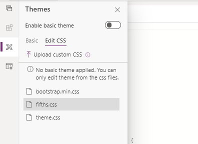
The five section is the more complicated. To begin, we take the CSS code from the Stack Overflow post and create a CSS file with the following content.
.col-xs-5ths,
.col-sm-5ths,
.col-md-5ths,
.col-lg-5ths {
    position: relative;
    min-height: 1px;
    padding-right: 15px;
    padding-left: 15px;
}

.col-xs-5ths {
    width: 20%;
    float: left;
}

@media (min-width: 768px) {
    .col-sm-5ths {
        width: 20%;
        float: left;
    }
}

@media (min-width: 992px) {
    .col-md-5ths {
        width: 20%;
        float: left;
    }
}

@media (min-width: 1200px) {
    .col-lg-5ths {
        width: 20%;
        float: left;
    }
}
We'll name this file fifths.css, and upload it through the 'Upload custom CSS' menu item from the Themes section of the designer.
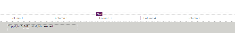
From a portal page, we can now define five equally spaced sections through the following HTML markup.
<div class="row sectionBlockLayout" style="display: flex; flex-wrap: wrap; padding: 8px; margin: 0px;">
  <div class="container" style="display: flex; flex-wrap: wrap;">
    <div class="col-md-5ths col-xs-6">
      Column 1
    </div>
    <div class="col-md-5ths col-xs-6">
      Column 2
    </div>
    <div class="col-md-5ths col-xs-6">
      Column 3
    </div>
    <div class="col-md-5ths col-xs-6">
      Column 4
    </div>
    <div class="col-md-5ths col-xs-6">
      Column 5
    </div>
  </div>
</div>
Here's the appearance of our page with the 5 equally spaced columns.
Conclusion
We can use the portal designer to add sections that contain 1, 2, or 3 equally spaced columns. To define additional columns, we can customise the HTML code. The Bootstrap framework is based on a 12 column grid. Therefore, it's not straightforward to define five equally spaced columns. In this post, we looked at how to accomplish this through custom CSS and HTML.