What's new in the updated Maker Portal navigation menu? A comparison of Old vs New
The Power Apps Maker Portal has been refreshed with a new look. What new features does this offer and how does it compare with the old layout?
How did the old menu layout in the Maker Portal look like?
The image below illustrates the old menu structure. This worked very well, but there were some things that I found awkward.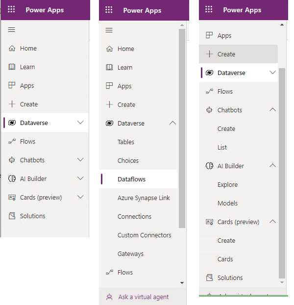
The first was that several irrelevant menu items were nested beneath
'Dataverse' folder, making them difficult to find. An example is the
'Connections' menu item. Let's suppose we create a connection to a SQL
Server data source. Subsequently, the password for the SQL data source expires and we
need to update the credentials. Nesting the 'Connections' menu beneath
Dataverse makes no sense and makes it difficult to find. The same
applies to Custom Connectors and Gateways.
What does the new menu in the Maker Portal layout look like?
The new menu structure is shown in the image beneath and it's a big improvement over the previous menu layout. It addresses the issues that I highlighted above.
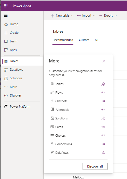
The menu is split into 3 sections. The first contains the Home, Create, Learn, and Apps menu items. This section is not configurable.
The second section contains Tables, Dataflows, and Solutions by default. We can click the '...More' menu item to add and pin additional menu items to this section. It's great to see that the 'Tables' menu item appears prominently at the top of the list, and that we don't need to navigate into a Dataverse sub-menu to find this. For app-builders completely new to Power Apps, this makes it easier to find and get started.
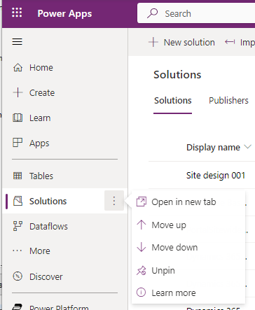
A great feature is that we can move menu items up or down. Suppose we frequently use Solutions, we can move this menu item further up the structure to make it more accessible.
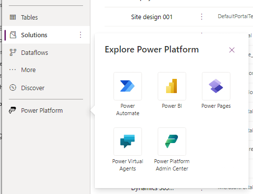
The third section in the menu features a 'Power Platform' menu item. This opens a flyout that enables us to access other members of the Power Platform. A useful addition is a link to Power Pages, which didn't exist previously.
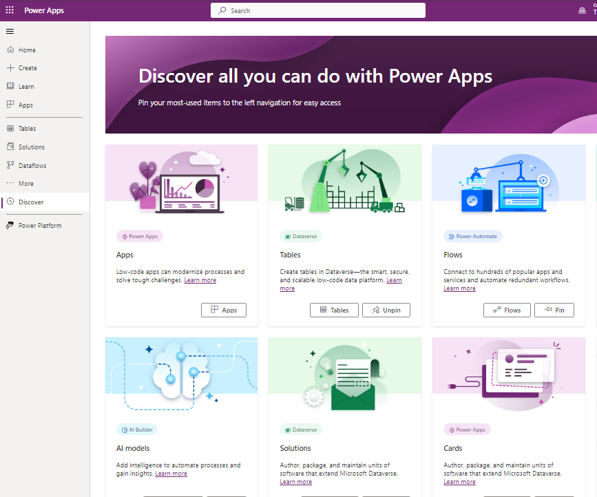
The New 'Discover All' Page
A new page is the 'Discover Page'. This is a visual page that describes menu items that we can add and pin to the menu.
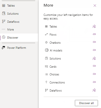
Missing Items in the new menu structure - how to restore them
With this new menu structure, the thing I struggled with was that several menu items were very difficult to find. For instance, the Custom Connector and Gateway menu items are missing from the '..More' flyout. These menu items are obviously very important if we want to manage Custom Connectors or on-premise gateways.
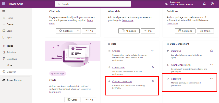
How do we add these missing items? The answer is to go to the Discover page. Towards the bottom are 2 sections - Data and Data Management. Within these sections, we can find the links to Custom connectors and Gateways.
Conclusion
The updated navigation menu in the Power Apps Maker is a big improvement over the previous menu layout. The layout is cleaner and provides more configuration options. The biggest issue for existing Power Apps users is that it might not be obvious how to find the menu items that existed in the old layout. All of the existing items can be found on the 'Discover' page.