Example - How to build hard-coded/data driven menus
A common practice is to build menus in data. I recently encountered an interesting question that related to a blog post by Mehdi Slaoui Andaloussi on how to improve screen performance through this method (link below).
The premise of the post is to improve app performance through a gallery control. This can effectively reduce the number of controls on a screen.
Since the implementation of this technique may not be obvious to users who are unfamiliar with some of the tricks that are related to the gallery control, this post describes the steps in Mehdi's post in more detail, and highlights an example of how to define a hard-coded menu structure in formula.
Defining the menu structure in code
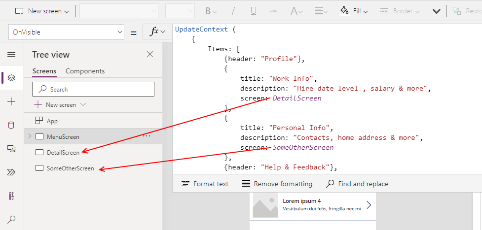
The menu item in the example relies on a context variable, shown below.
UpdateContext (
    {
        Items: [
            {header: "Profile"},
            {
                title: "Work Info",
                description: "Hire date level , salary & more",
                screen: DetailScreen
            },
            {
                title: "Personal Info",
                description: "Contacts, home address & more",
                screen: SomeOtherScreen
            },
            {header: "Help & Feedback"},
            {
                title: "Give Us Feedback",
                description: "Share with us your experience",
                screen: DetailScreen
            }
        ]
    }
)
We can set this variable in the OnVisible property of the screen that will host the gallery control.
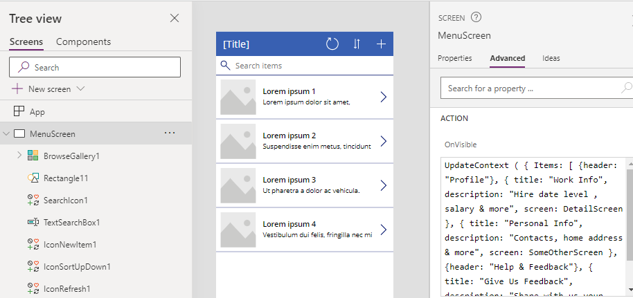
The interesting thing about this data structure is that it contains two types of data row - rows that define a header, and rows that define menu items that sit beneath the header.
Each menu item in the structure includes a field called screen. This defines the target screen that opens when a user clicks the menu item in gallery control. For example, the work info row references a screen called XXX
Creating the menu control
To create the menu control, we add a gallery control to the screen and we set the Items property to Items.Value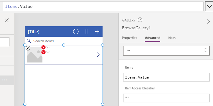
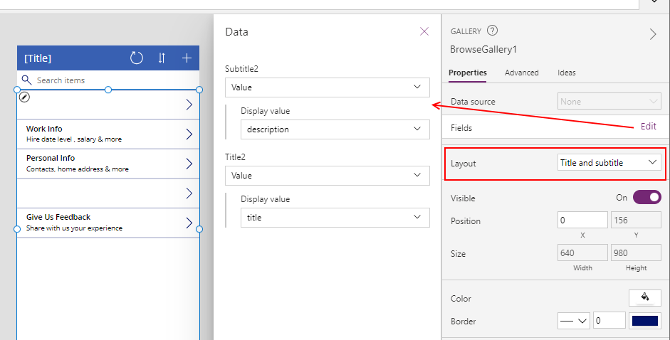
Next, we set the layout to 'Title and subtitle'. We then click the Fields > Edit link, and set the subtitle and title properties to Value>description and Value>title respectively.
Configuring the menu group header
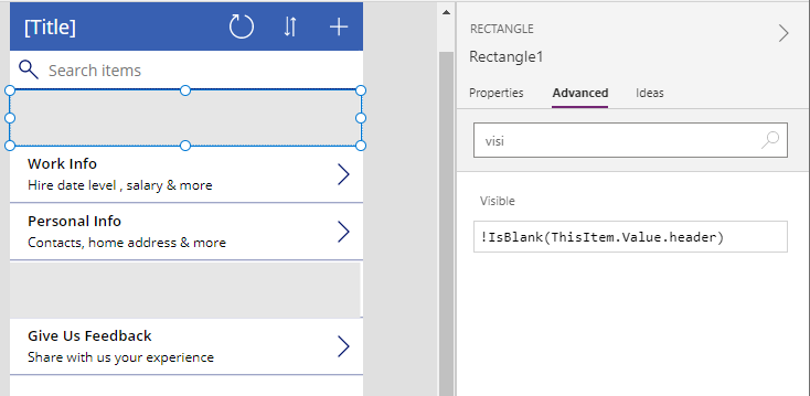
To build the group header, we add a rectangle control above the existing items (through the insert>icon>rectange menu item) and we set the background colour of this to gray.Since we only want to display the grey rectangle for header items, we set
the visible property of the rectangle to the formula below
!IsBlank(ThisItem.Value.header)
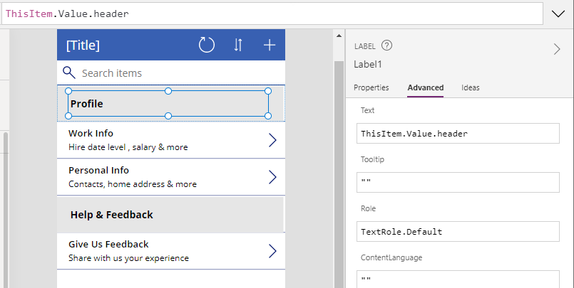
To display the group header text, we add a label above the grey rectangle and we set the text property of the label to the following formula.
ThisItem.Value.header
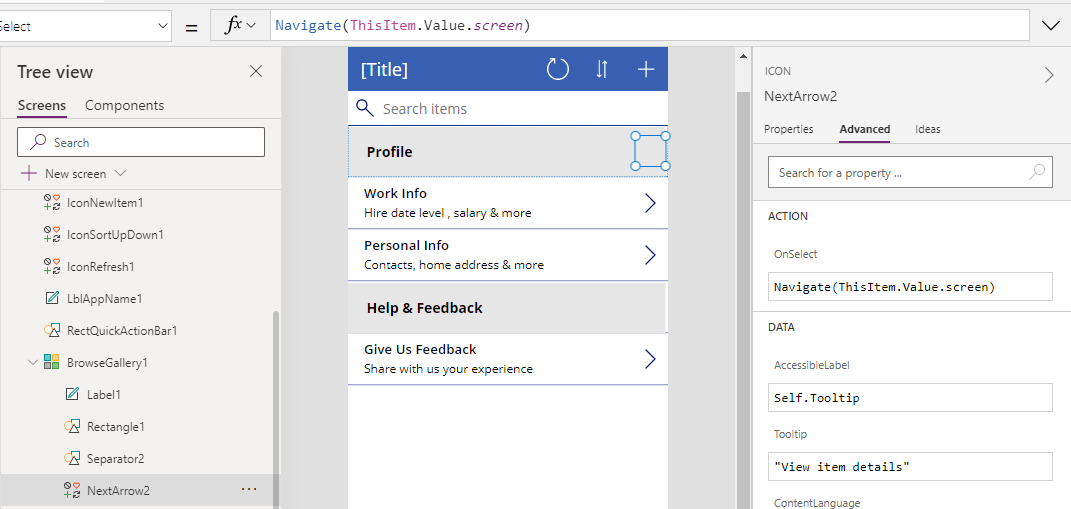
Configuring the menu navigation
The final part is to configure the gallery icon to navigate the user to the target screen. To do this, we set the OnSelect property of the icon to the following formula.Navigate(ThisItem.Value.screen)
This completes all the necessary steps and the menu will now display and work as expected.
Conclusion
Building data driven menu can provide many benefits, and this post demonstrated how to carry out this task by walking through the steps of a menu structure that was highlighted in a blog post by Mehdi.